Fonts: AG Stencil and Arial
Colors: black, white, orange, grey
Thursday, March 26, 2009
Monday, March 9, 2009
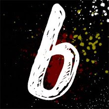
thisisit


Here's my idea for my portfolio site, basically all the type faces and the color scheme below will be used. I modeled my resume which i will post as well after these and I think they fit well.
I'd like to link the blog page with my blog at www.blackpixi.com
and under contacts have various popular social networking links to my profiles as well.
I think a thumbnail image of my face would be cool, or it might frighten people away, I don't know, I need input on this.
Wednesday, March 4, 2009
5 Concepts

This is original vector art i created to go off of a blackpixi mascot or icon. I was thinking of having it on a homepage and flash animated, you can rollover and click on different parts of the face and interact with it, then you get taken into a site like gomedia's which houses my portfolio.
I've said it a lot and shared it in class, but I really like the in your face look of many professional portfolio sites, ones that showcase the work first, then the artist second.
1. For my first concept, I'd like to do a full showcase of all of my portfolio pieces in a manner like
gomedia.us does. List format, top to bottom, easy to see, and the contact information is there, but not as large as the work itself.
2. HERE I like this guys site a lot, it has information for every piece, it's clean, utilizes basic code, html/css so there's nothing to worry about flash working or not working with an employers browser/computer.
3. A popular concept, *I don't know if this is really a concept* but it's to include a wordpress blog/portfolio in one. It's tricky, and must be done cleanly to be pulled off as not overwhelming, but I think it'd be a good idea if done right. Would show an employer that you're current.
4. HERE A slideshow that displays just my work. A cool flash application, like Dave Hill
5. Michael Muller HERE He does a lot of portrait photography and portrait manipulations, thats just what i do to.
what my Portfolio shall include...................
My digital portfolio NEEDS the following:
1. Contact Information (Phone, E-mail, website, address, etc.)
2. A resume that reflects my qualifications, experience, schooling and all the formal crudentials like most consecutive beer pong wins.
3. I'd most likely like to include a short biography of interests and background information. Something that gives my hobbies, interests, some freelance jobs I've been involved with.
4. A portfolio of my digital work, in the following categories:
a. Logos
b. Print work/Typography
c. User Interfaces
d. digital images
e. photographs/portraits
Tuesday, March 3, 2009
hows bouts my work

This shot shows the progress of the project. The timeframe was around 30 minutes for the project and the objective of the assignment was to convey a thought or idea with simple use of text/color/placement. The idea was to convey the slogan "taste the rainbow" used by the candy Skittles in advertisements, often displaying a rainbow and the candy product. I wanted every element to be essential, without one, the piece wouldn't make sense.
Done in Photoshop CS3
Monday, March 2, 2009
pictures worth no words

This is something I did a while ago, but never got around to hosting it on flickr or anywhere on the internet for that matter. It was a typography poster for a certain candy company I did for fun (you'll never guess which one.)
"Skittles"
I thought this worked particularly well because if you subtract the text from the image, the viewer has no idea of what it's about, and if you do the same for the rainbow gradient, and leave the text, it makes no sense.
Subscribe to:
Posts (Atom)